A burger brand that doesn’t ask to be liked
Brand identity and packaging for a burger chain built on a single idea: no mascots, no comfort, no apology just a name loud enough to fill the bag.
Client
Bruno's Burgers
Role
Branding & packaging
Timeline
5 weeks
Outcome
Identity + packaging
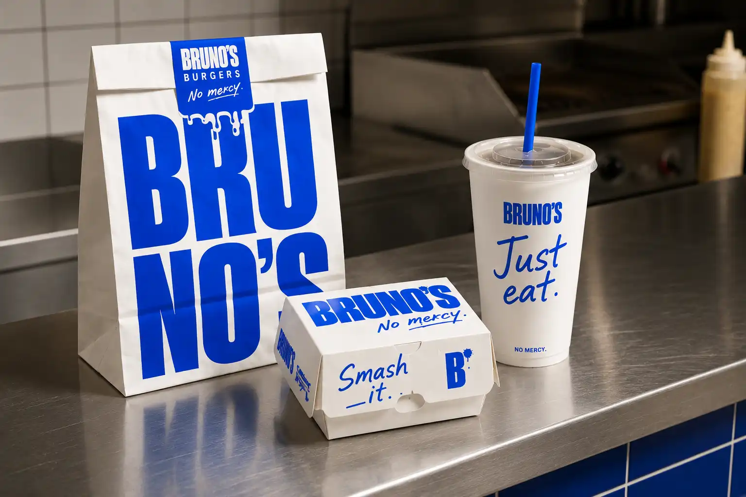
Overview
Most burger brands compete to look more "fun" than the one next to it: mascots, rounded type, a visual vocabulary built to feel friendly before it feels like food. Bruno's starts from the opposite idea, if the burger is loud, greasy and unapologetic, the brand shouldn't try to soften that.
The brief came from Bruno's looking for an identity that would work at highway speed and at arm's length on a tray liner: instantly readable, cheap to print in one color, and confident enough to skip the small talk most fast-food branding relies on.
Concept & naming
The concept behind Bruno's is confrontation instead of persuasion, a brand that tells the customer what to do rather than what to feel. No invented mascot, no promise of "joy" or "flavor journeys" on the packaging.
The line that ended up carrying the whole system was "No mercy". It isn't a tagline in the traditional sense; it's an instruction, delivered the same way the food is: fast, direct, no explanation needed.
Visual system
Where most burger brands lean on appetite photography or illustrated characters, Bruno's uses type and a single color instead, a move that lowers the visual noise and lets the wordmark do the work other brands give to imagery. Bruno's Blue is the only color in the system: no red, no yellow, no seasonal variation, just one confident cobalt against uncoated white.
The core visual element is the wordmark itself, Bruno's, so the name becomes a block rather than a sentence, repeated at full scale on the bag and reduced to a small badge on napkins and sachets. A second graphic device, a hand-drawn "B" splatter, is repeated into an all-over pattern that wraps the softer pieces of the system, the burger itself, the tray liner, while the harder pieces stay logo-led. Short, handwritten instructions (Just eat., Get in., Smash it.) sit underneath the wordmark on cups, fry sleeves and boxes, talking to the customer the way a friend would, not the way a menu board would.
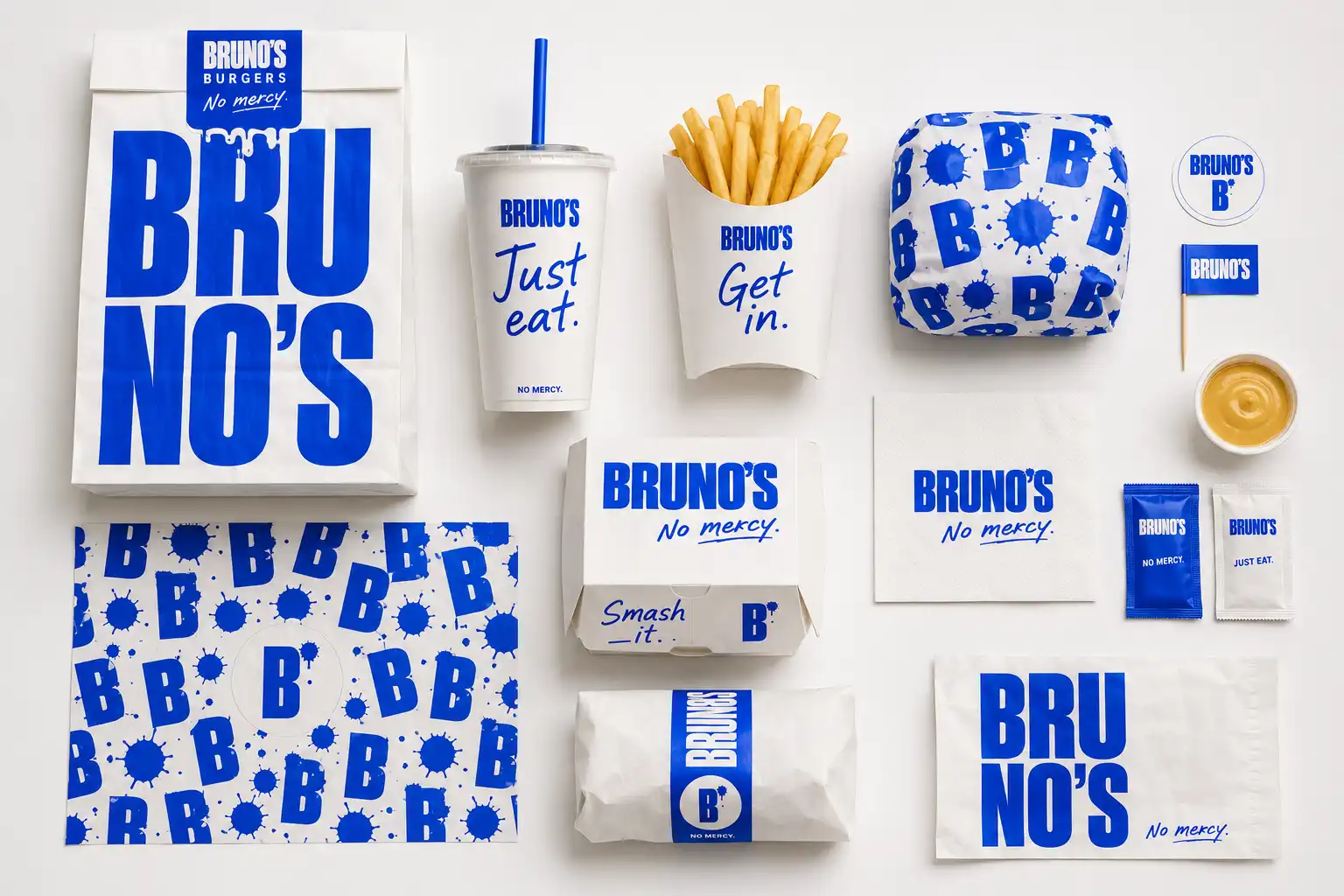
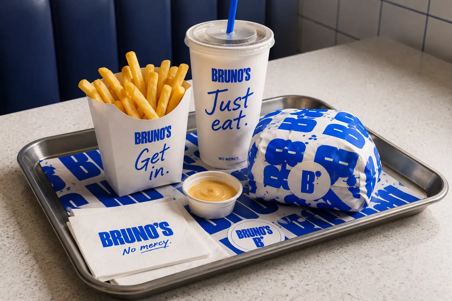


Identity and packaging for a burger brand that doesn't need to dress up what it sells.