Brand identity and app concept for a surf-forecasting platform, built around clarity, community, and a visual language that skips the usual ocean-blue cliché.
Client
Orb
Role
Brand & product design
Timeline
8 weeks
Outcome
Full identity + app
Overview
Most surf forecast apps show the right data in the wrong way. Charts, graphs, and wind maps that make sense to meteorologists, not to the surfer deciding whether today is worth the drive. Orb starts from a simple idea: the same information, read in seconds, not decoded.
The brief came from the Orb, looking for a tool that could serve both new surfers and regulars, clear enough for a beginner, precise enough for someone chasing a specific swell.
Concept & naming
The concept behind Orb is simplicity, an app that respects how little time a surfer wants to spend reading a screen before paddling out. The name came from "orbe" (sphere, world), chosen for its sense of movement and of belonging to something shared: a community, not just a forecast.
Naming exploration ran through dozens of surf and community-related word pairs before landing on Orb, short, easy to say, and open enough to hold both the product and the community around it.
Visual system
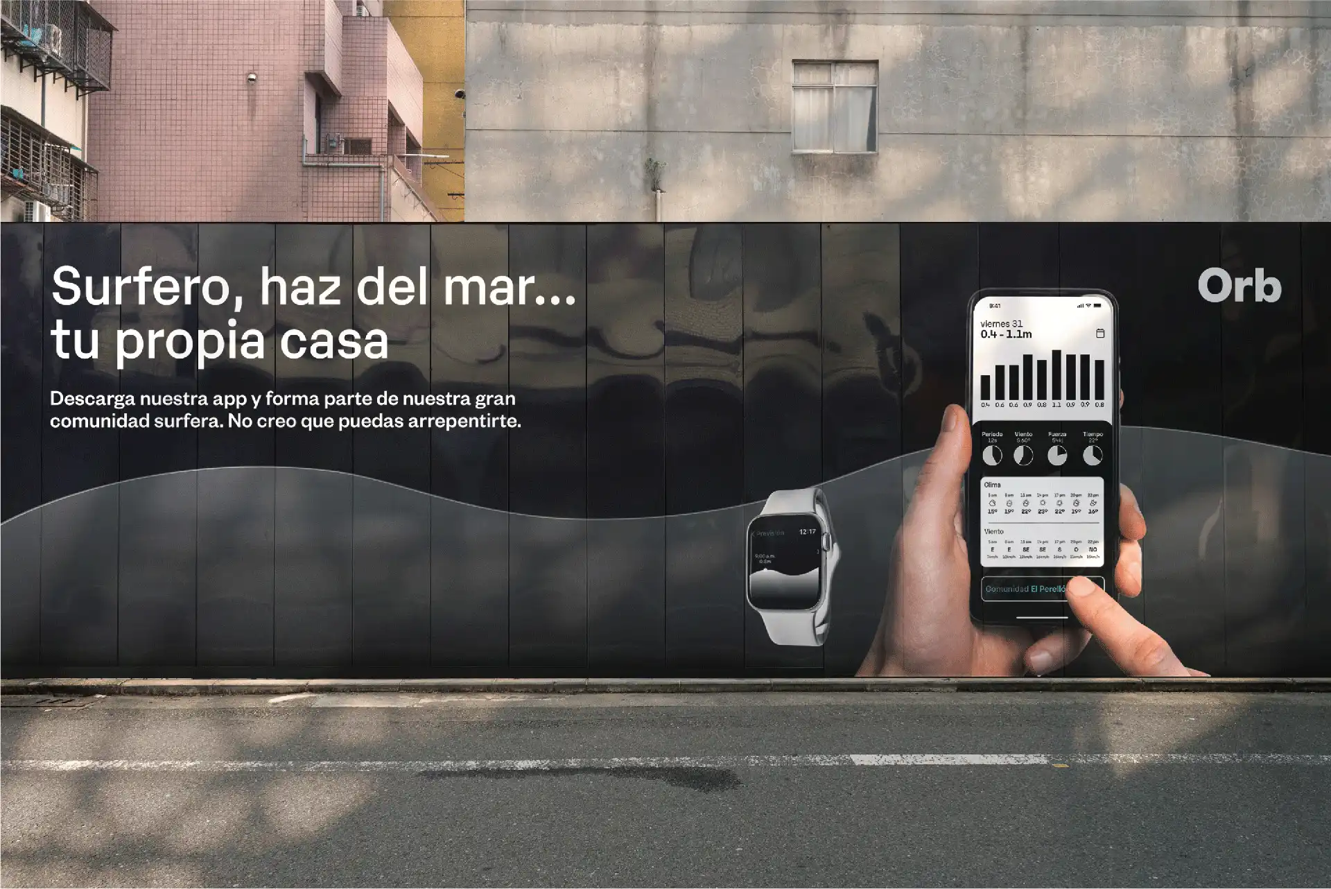
Where most surf brands reach for blue, Orb goes black and white, a deliberate break from the category, built to feel precise rather than decorative. Founders Grotesk carries the structure; Karelia adds contrast in smaller, softer moments.
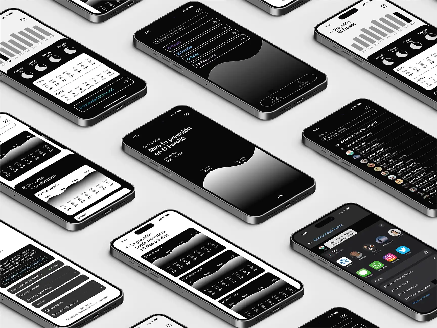
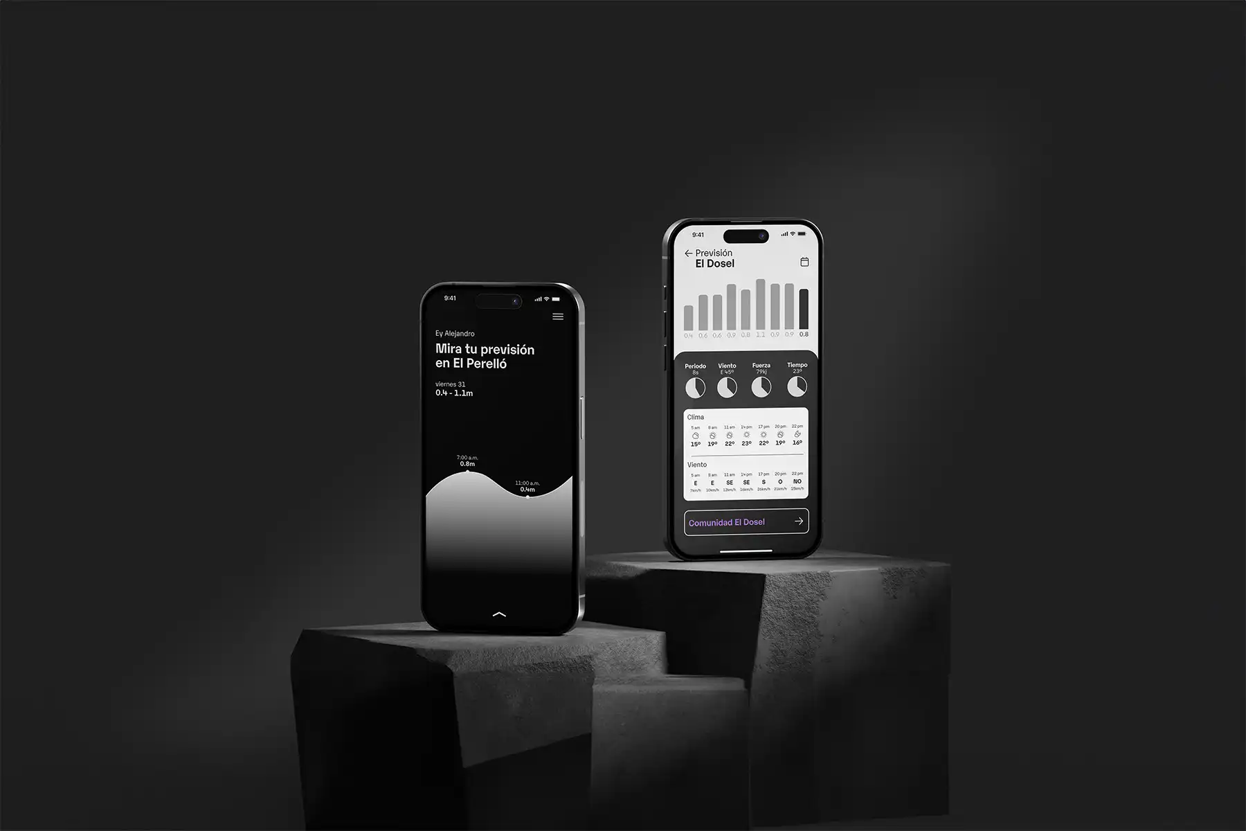
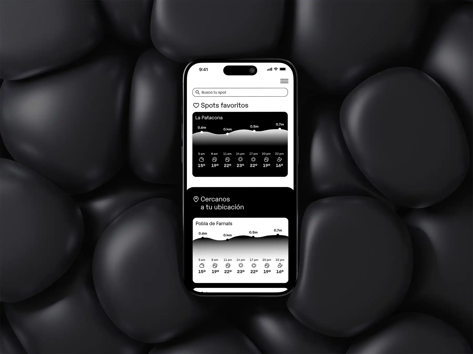
The core visual element is a single wave, rendered as a white-to-transparent gradient. It appears in the icon, the onboarding screens, and the data visualizations, one shape, repeated with enough restraint to hold the whole system together.

Design principle