Brand identity and packaging for a natural canned juice company, built on a single idea: real fruit, no embellishment, no empty promises.
Client
Pulp
Role
Branding & packaging
Timeline
6 weeks
Outcome
Identity + packaging
Overview
Most canned juice brands compete to look more "premium" than the one next to it: gold typography, busy illustration, a visual vocabulary that promises a lot and says little. Pulp starts from the opposite idea, if the product is 100% fruit, no added sugar, the brand doesn't need to dress it up as anything more.
The brief came from Pulp looking for an identity that would work just as well on a supermarket shelf as on social media: honest, instantly recognizable, and able to scale to new flavors without losing coherence.
Concept & naming
The concept behind Pulp is reduction to the essential, a short, direct name that is literally what's inside the can. No invented words, no wordplay that needs explaining on the packaging.
The naming exploration ran through dozens of terms tied to fruit, freshness, and natural origin before landing on Pulp: a word that reads in a second and already sounds like what it is.
Visual system
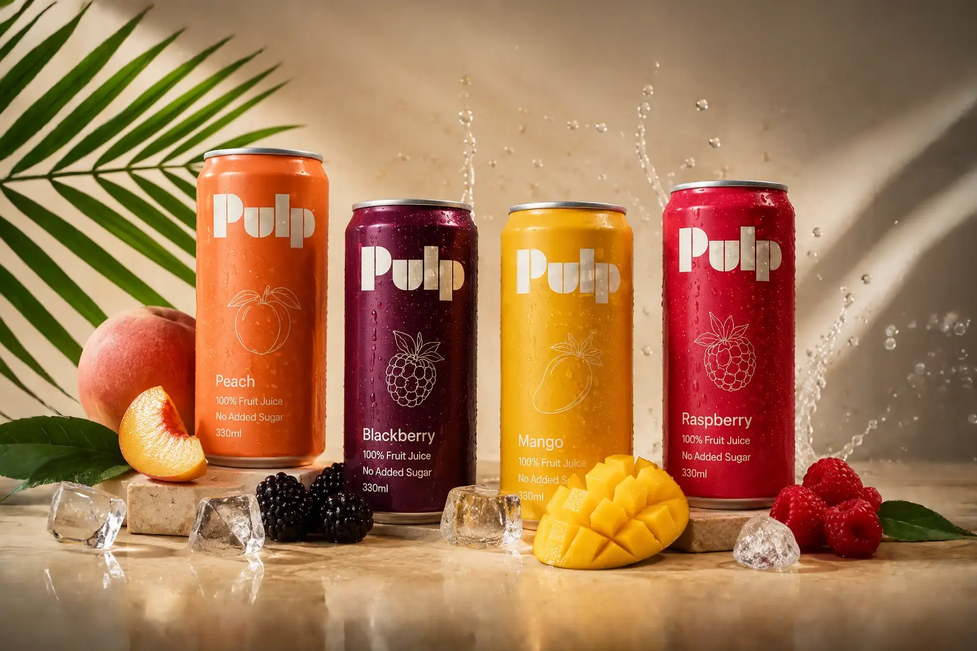
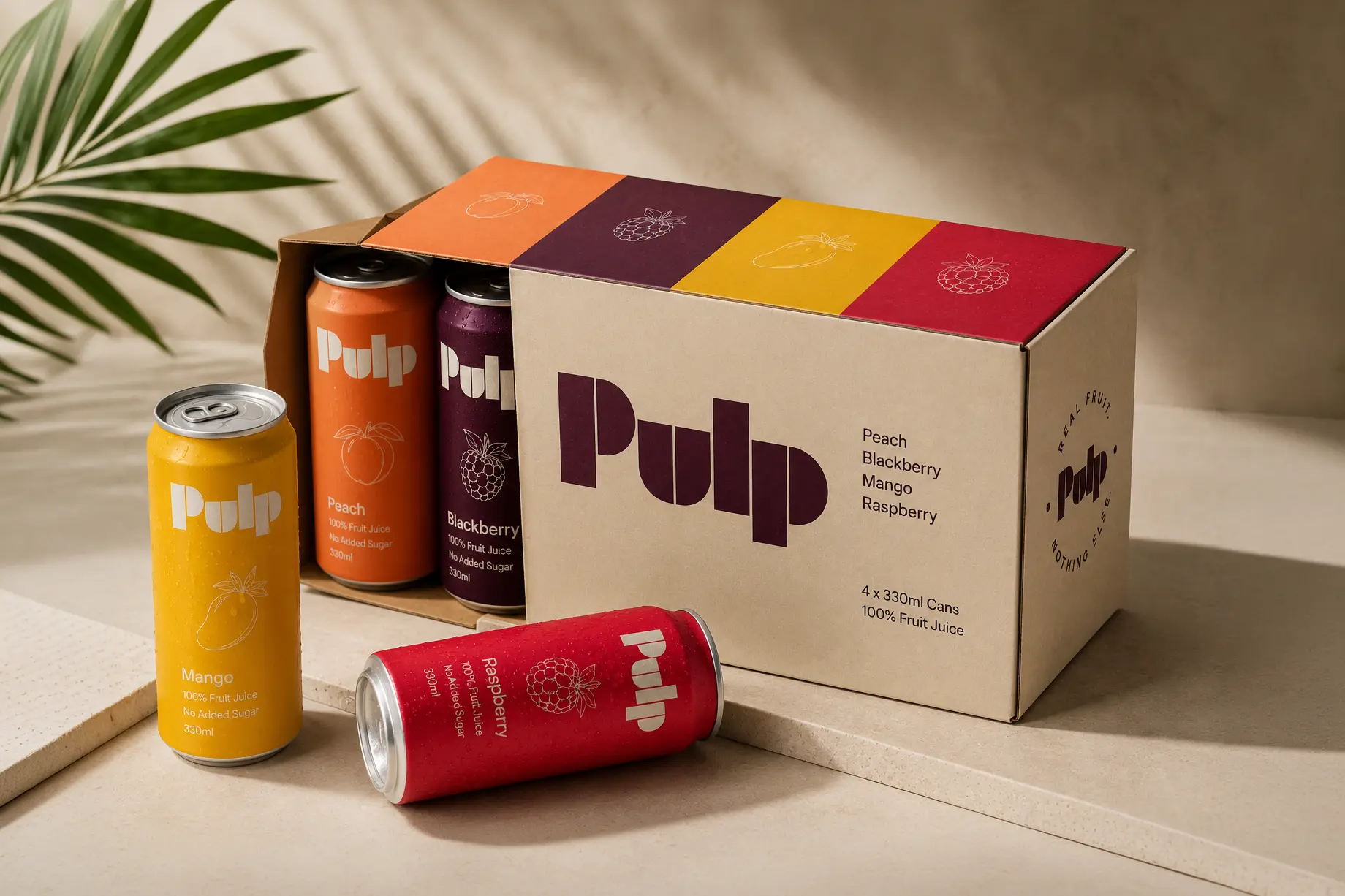
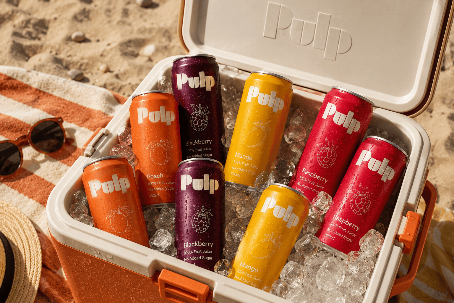
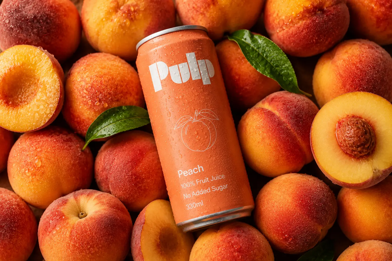
Where most juice brands lean on hyper-realistic fruit photography or liquid splashes, Pulp uses flat color and line illustration instead, a move that lowers the visual noise and lets color do the work of telling flavors apart. Each variety has its own saturated tone (peach, blackberry, mango, raspberry), and all of them share the same geometric logotype and the same thin-line fruit icon.
The core visual element is the fruit drawn in white outline against the background color, repeated on every can, on the outer packaging, and across communications, a single graphic device that carries the whole system and lets new flavors be added without redesigning anything.


Identity, packaging, and digital design for brands that don't need to dress up what they sell.